The situation
HGTV Home by Sherwin-Williams had a main navigation of twelve options, and the one getting the most use was a utility, not content. Users trusted several categories so little that they answered "don't know." I came in through my consultancy, working with the agency Mono.
What I did
- Ran a baseline taxonomy study, then tested a proposed structure against it.
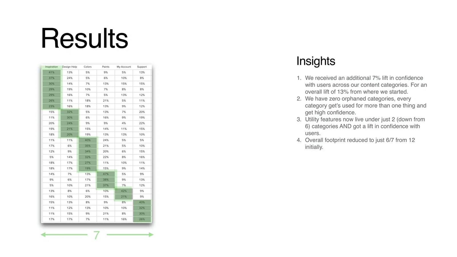
- Tested two named theories in sequence: a missing design-help category between inspiration and color, and folding six utility categories into two, My Account and Support.
- Validated the final structure with a Treejack tree test.
- Framed the site around the do-it-yourselfer's path: inspiration, then color, then paint.
- Delivered the validated sitemap, user journeys including the unhappy paths, a page-by-page content strategy, and a measurement plan that keeps purchase intent apart from engagement.
- Advised on accessibility for the AEM build.
What changed
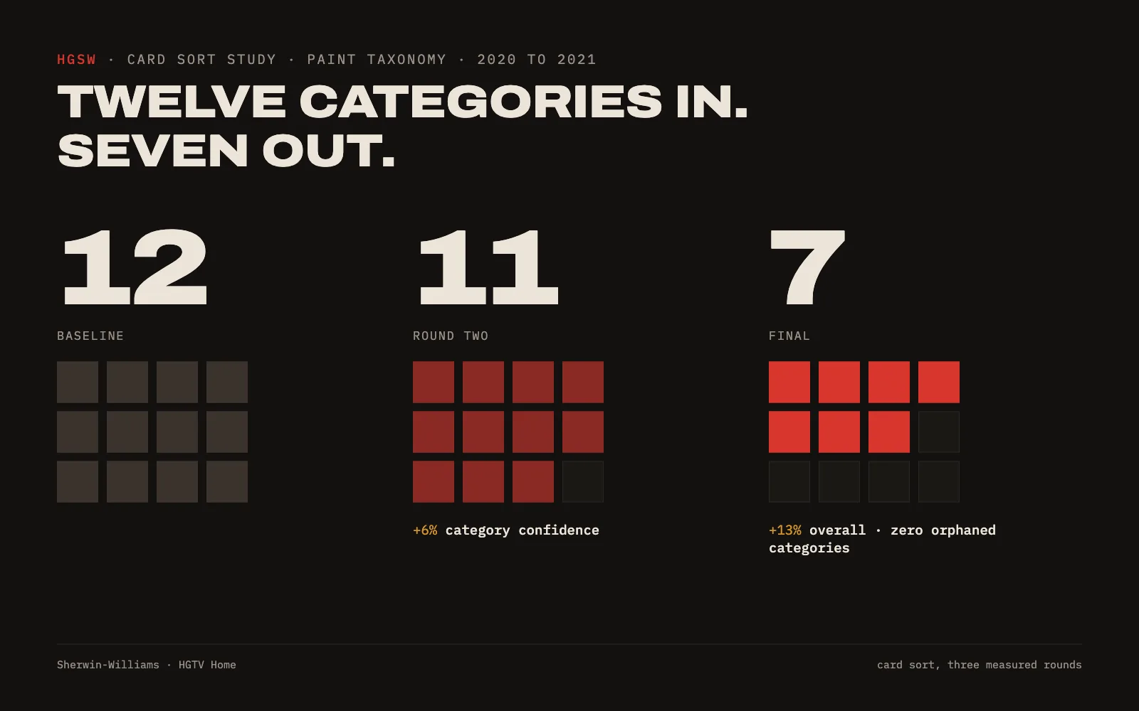
- User confidence in the taxonomy rose 6% in round one and another 7% in round two, 13% overall from the baseline.
- The navigation went from twelve categories to eleven, then seven.
- Utility features moved from six categories to two, and confidence still went up.
- Zero orphaned categories: every category that survived is used for more than one thing.
What it says about working with me
I test the structure with real users before anyone builds it, and I show you the numbers.